Blog Guidelines
Your blog or website is the “first impression” you make when reaching your target audience. People typically spend no more than 10 to 20 seconds on a web page. Therefore, a great design can buy you time because it stands out and puts your visitors in a comfortable frame of mind long enough for them to get hooked on your content.
Design can take years to master, but you can learn the basics pretty quickly. By learning the basics of colors, layouts, fonts, graphics and a few other things, you’ll end up with far better results than if you just jump right in and start tweaking your site.
One of the best ways to develop your own great blog design is by looking for inspiration elsewhere online. Think about your favorite sites and what you like about them. Think about why those features, colors, layouts, etc. are attractive to you.
BUT: Don’t just copy one you like, because that would defeat the purpose of customizing your design to make it unique. Instead, keep track of the things you like from different sites. Take notes, and try to use certain aspects from several different sites you like to create something special that symbolizes YOU.
Here’s a list of things I suggest you consider when designing your blog:
Make a Great First Impression
Your website represents who you are and what you offer. When people see it for the first time, they’re considering just a few of the following items:
- Is this site inspiring
- Is it created by a trustworthy person
- Does it look professional
- Can I find what I need
- Does this site make me feel welcome

You need to ask yourself all of these questions when designing your website. The design of your blog may not be the most important factor overall (content is), but it does play an important role in making a good first impression.
Aside from being visually pleasing, there are three main goals you should focus on:
- Present your content in an easy-to-digest way
- Lead your visitors to connect with you so they’ll come back, either via social media or by subscribing to email updates.
- Make it easy for visitors to share your content
Design for readability
Easy reading is enjoyable reading. Correct spacing, coloring, and typography is essential to making your blog a pleasure to read. So make sure to:
- use dark type on a light background;
- use a readable font
- use a good column width that is not too wide or too narrow;
- use letter, word and line spacing that is pleasant to look at.
Avoid distractions
Avoid distractions on your pages, things such as flashing advertisements, too many colors or animated graphics.
Bright colored side panels and backgrounds will draw the eye away from your content.
Make sure your focus is on your content to maintain interest. If your blog is too long, people may get tired of reading it or become easily distracted. Cut it down to a reasonable reading length or split it up into parts or pages. Use beautiful pictures to break up the written sections.
Always upload images at the width of your blog post
There really isn’t much point to uploading giant sized images to your site. You still want it to display only as wide as your post, and it just makes your site run slower if the image file is too large. I highly recommend not using images less wide than your blog post, because then you start having all sorts of different width images in your posts and it just looks messy.
It looks so much better to always have your images the same width – no wider and no more narrow than your post. So if your blog width is 500 px make sure your images are 500px. Personally, I only upload images to my site that are 700px wide – which is the width of my blog posts. It keeps it nice and easy because you don’t have to resize images on your blog.
Choose a readable font
Lots of blogs now come with the option to change the font. Some font choices aren’t as good as others; some are quite microscopic. And no matter how pretty a blog is, if people can’t read your blog they’ll move on. Recommended easy-to-read fonts are Arial, Helvetica, or Georgia.
A good font size (of course depending on the font design) is 12, 14 or 16 points. You’ll have to test it to see what looks best. Make sure it’s easy to read.
Help the reader navigate to related content
Here’s why it’s a good idea to include navigation links in your blog design – it lets people browse through all of your previous content easily, not just what’s on the first few pages. Since you spent time crafting your past posts, you will want people to be able to read them.
Most visitors, myself included, hardly ever make it past page 3 on a blog unless there are teasers for more content; like “you may also like…”, which you can put on the sidebar of your blog or below each blog post (like I do on my blog).
Make sure to also include a search bar and your blog archive.
Make it easy for visitors to leave a comment
Comments are a huge part of blogging. You want your readers to be able to interact with you as easily as possible. Most people who visit your blog won’t leave a comment – but of those who do choose to leave a comment, you don’t want to make it difficult for them.
It is very common for people starting to comment to end up not leaving their comments because of CAPTCHA. (CAPTCHA is that spam catcher thing that makes you type in the hard to read letters to be able to leave a comment.) That can easily cause people to choose to skip commenting!
Add social media buttons
Make it easy for people to connect with you using Twitter, Facebook, Pinterest, Instagram, or whatever other social networks you use.
You can put these in your header, sidebar, footer or on your about page – or, even better, a combination. You can also put “follow me ” links at the end of posts.
There is no “right” answer on how to do this, but make sure you have these somewhere that’s easy to find. The more important a particular social network is to you, the more prominent you should place the connection option.
You can create your social media buttons yourself in photoshop or use ready-made buttons. Some you can find for free and some you can buy. You can also pay a designer to make them for you.
Add Email sign-up forms and/or subscribe via RSS
One of your biggest goals should be to get your readers to subscribe, so it will be more likely they’ll return. It’s hard to grow a big audience unless you convert your hard-earned traffic into return visitors.
For blogs, you should focus on email subscriptions as your first priority, with RSS as a second option. Email has by far the biggest return rate of any connection method, including social media.
I recommend Convertkit for building your email list. You can also use an RSS feed and set it up so readers get your post directly sent to their inbox every time you post.
There are four key spots I recommend you place your email sign-up forms:
- in your sidebar
- at the end of each post
- in your footer
- on your about page
Research shows these are typically the highest converting places.
Include social proof
My husband was a huge advocate for this, He would stalk my site and tell me I was missing links and badges to places that I have worked and awards that I had won. I didn’t really care but I got it as I grew in the blogging world. It’s human nature to do what others are doing. We look to see what others like, and it seems that the more people that like something, the better we think it must be. It’s not always true of course, but it’s what we tend to think.
Here are a few ideas to help grow your blog and business faster., try including some or all of the following:
- Testimonials
- Publication logos
- Client logos
- Size of social network
- Award badges
- Pictures of you with a special person or doing something special
- Mention any past success, awards or exhibitions
- Mention if you’re a member of a photography network or organization
- List number of subscribers
- Mention any guest blogging gigs
- Promote any interviews you’ve given
Picking the right colors for your blog.

The best way to harness the power of color is to use colors that support and reinforce your message. Don’t go crazy: just pick two or three main colors, and use those colors consistently.
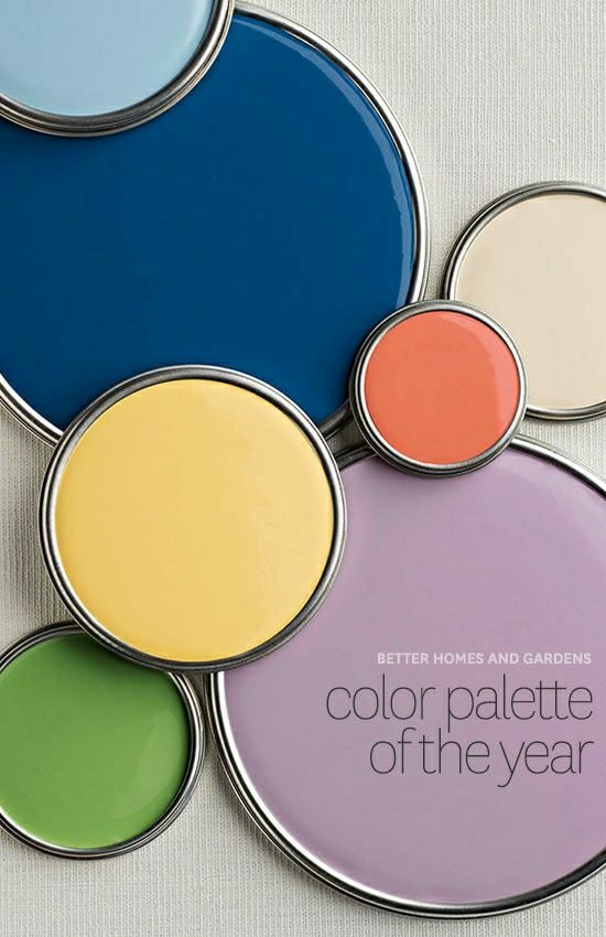
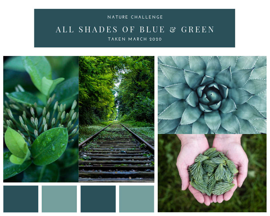
But, how do you pick colors that will look great together? You may not feel “artistic” enough to know what to choose. You just want a nice set of colors that will work for your blog. So here’s a little trick that I use. I check Pinterest for color boards. When I look at the different color boards that I find on Pinterest, I consider whether the colors would fit my business and my blog.
The color boards inspire me to match color tones and put colors together. When I find a color combination I like, I play around with the colors inside of Photoshop. I upload the result to my site to see if it looks good.

I’ve collected some color boards on Pinterest so that you can find inspiration for your own blog. Just click on the link below. https://www.pinterest.com/madcrisimages/branding/
How did you design your blog? Did you find any of my tips helpful in your process? I’d love to see your results!
https://www.pinterest.com/madcrisimages/branding/
