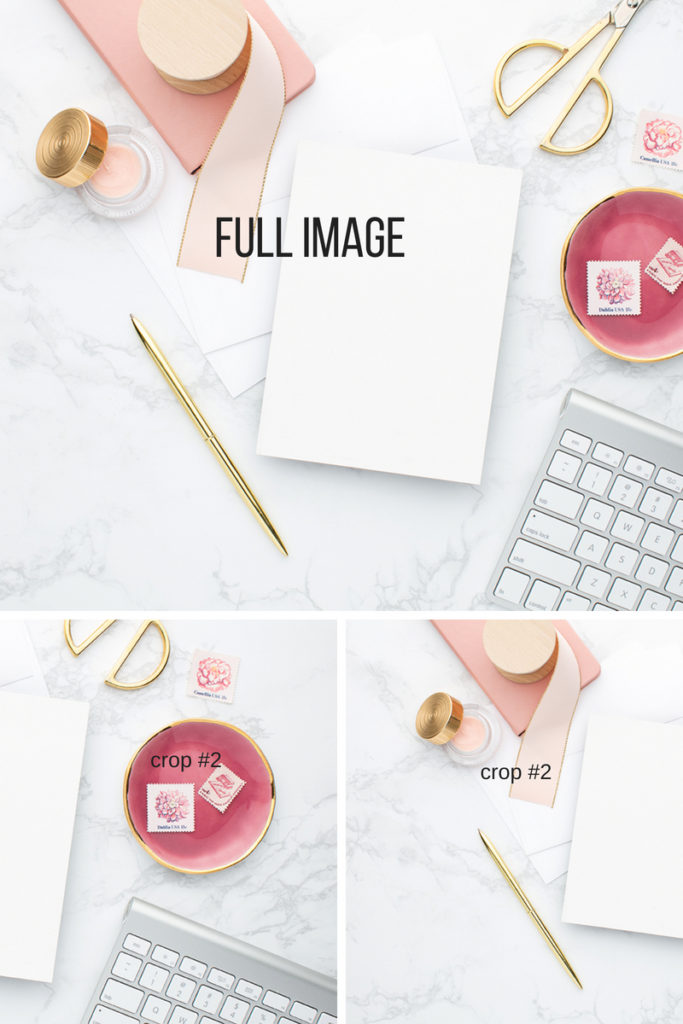
1 . SELECT IMAGES THAT HAVE MULTIPLE CROP OPTIONS.
By selecting images that you can zoom in on, rotate, and crop, you’re able to gain a consistent look/feel across your brand images without having to search for multiple images that give off the same vibe. By doing so, you’ll get several uses out of one image, saving you valuable search time and keeping your visuals on brand.
Select images that, when you cropped or zoomed in, have a unique look of their own, but still stay within your overall brand styling. If you are using a flat lay photo, look for images that either has low to no shadow, so if you rotate the photo, the viewer can’t tell that the image has a shadow that’s out of place.

2. LOOK FOR IMAGES WITH PLENTY OF NEGATIVE SPACE.
These types of images are important for your brand because pictures with strategically placed negative space will allow you to customize them with content such as headlines, title, products contact information and so much more. Think of these as billboards for your business that you can customize to fit the needs of your brand.
 Look for images that are different orientations and sizes. For example, choose a horizontal image for headers and vertical layouts for blog post graphics, Pinterest and more.
Select images that use the same props or overall tone and style to bring all the different areas of your brand graphics together seamlessly.
3. SELECT IMAGES THAT CONVEY A SPECIFIC FEELING.
Looking to ignite a specific feeling like warmth, vibrancy, or urban chic for a special offering or event? Search for images that will instill that vibe but still stay true to brand. Don’t be afraid to use images with objects like flowers, blankets, hot cocoa, or beach items — props that compliment the messaging will enhance those feelings.
4.(How to) USE IMAGES WITH PEOPLE
How would you define your tribe? Are they classic and chic, super trendy, hipster, or whimsical?
Finding images with people that possibly resemble you or your target market can form an instant connection between your content and the user. So don’t be afraid if every image with a person in it is not you-you can still be consistent in your brand messaging even if you use other people in the images you select.
5. USE IMAGES WITH A MATCHING COLOR PALETTE.
Using images with a similar color palette is one of the easiest ways to get more out of styled stock. Canva.com is a great way to help you with creating a brand and color palette on a budget. By sticking with a clear palette, you’ll find it much easier to determine which images will or will not compliment your overall brand aesthetic. Now, you don’t have to go overboard and match everything to a branding T, but by keeping the base palette consistent, you can then use different pops of color throughout the year and for special occasions that will still keep everything looking professional and fresh.
